section_1
Products
This category is empty! Please try another category or use our search function to find what you are looking for. If you require further assistance please contact us.
Filters
Using Colour Theory in Interior Design
In the realm of interior design, crafting captivating spaces that leave a lasting impression is no easy feat. Interior designers wield a powerful toolset, and at the core of their craft lies the magic of colour theory. Understanding the psychological and emotional impact of colours enables designers to transform ordinary spaces into extraordinary havens of beauty and functionality.
1. The Basics of Colour Theory
Colour theory is a branch of study that examines how colours interact with one another and how they influence human emotions and behaviours. It delves into the relationships between primary colours (red, blue, and yellow) and their secondary and tertiary counterparts, resulting from mixing these primaries in different proportions.
2. The Psychological Impact of Colours
.jpg)
Each colour evokes a unique set of emotions and associations. For instance:
Red: Symbolizes passion, energy, and love. It can stimulate appetite, making it a popular choice for dining areas and kitchens.
Blue: Instills a sense of calmness, tranquility, and productivity. Bedrooms and offices often feature shades of blue to foster a relaxed and focused atmosphere.
Yellow: Radiates happiness and optimism. It can be employed in spaces where creativity and enthusiasm are desired, such as playrooms or workspaces.
Green: Represents nature and growth, inducing feelings of balance and harmony. Green is frequently used in living rooms or areas with plants to bring the outdoors inside.
Purple: Elicits a sense of luxury, spirituality, and creativity. It can be incorporated as an accent colour in bedrooms or lounges.
Orange: Exudes enthusiasm and warmth. It can be used in social spaces like living rooms or gathering areas.
3. Creating Mood through Colour Schemes
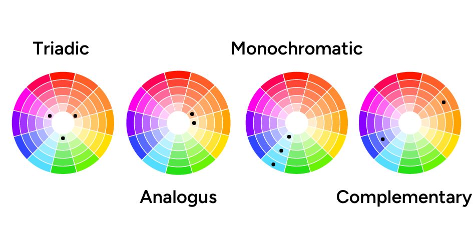
Colour schemes are combinations of colours that work harmoniously together. Some popular colour schemes in interior design including:
Monochromatic
Utilizing shades and tints of a single colour, this scheme creates a serene and sophisticated atmosphere.
Analogous
Selecting colours that are adjacent to each other on the colour wheel, this scheme provides a cohesive and calming feel.
Complementary
Pairing colours that are opposite each other on the colour wheel, this scheme offers a vibrant and dynamic ambience.
Triadic
Combining three colours evenly spaced on the colour wheel, this scheme achieves a balanced and visually stimulating effect.
4. Considerations for Room Size and Lighting
The size of a room and its lighting conditions play a crucial role in colour selection. Lighter colours tend to make small rooms appear more spacious, while darker hues can create a cozy and intimate atmosphere. Rooms with ample natural light can accommodate bolder colours, while rooms with limited natural light may benefit from lighter shades to avoid feeling gloomy.
Styling | Three Birds Renovations - House 14
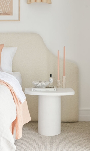
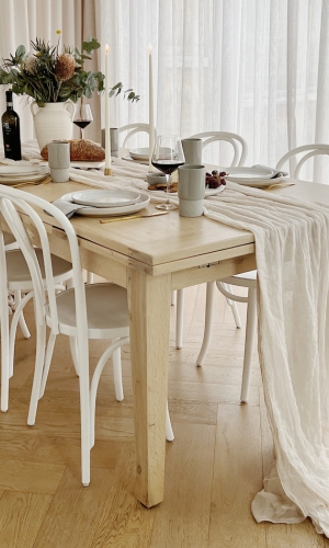
5. Balancing Boldness with Neutrals
"With a space filled with warm neutrals like creams, sandstone, soft timber, don't be afraid to add colours like or clay for an added pop of personality to your canvas." - Rebecca McCormick, Creative Director.
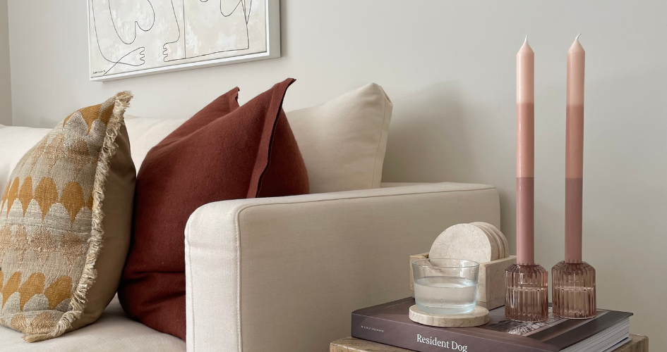
While incorporating vibrant colours can bring life to a space, it's essential to strike a balance. Too many bold colours can overwhelm the senses, and that's where neutrals come into play. Neutrals like whites, greys, and earth tones act as a canvas to allow other colours to shine while grounding the overall design.