








5 Rules to Help to You Match Your Wedding Candles and Florals
When you have your florals sorted, and you open the candle range for the first time, you will find a lot of colours staring back at you. It is natural to go completely blank. Do you pick a shade that matches? A shade that complements? Does it need to be exact? What is the difference between Antique Pink and Heritage Rose?
Here is the good news: you do not need to be a colour expert to get this right. You just need a few clear rules. These five apply whether you are working with hand-arranged artificial arrangements, fresh flowers from a florist, or anything in between, because the principles are about colour, not about the flowers themselves.
Rule 1: Warm tones with warm, cool tones with cool

The most useful thing to understand about colour is temperature. Every colour sits somewhere on a scale between warm and cool, and keeping your florals and candles in the same temperature family is the single move that will make your table feel intentional rather than accidental.
Warm colours include blush, peach, terracotta, champagne, and burgundy. These florals pair naturally with warm candles such as Antique Pink, Heritage Rose, Latte, Baked Clay, and Ivory, all of which sit in this warm-tone family.
Cool colours include white, lilac, French blue, sage green and navy. These want cool or neutral candles alongside them: White, Stone, French Blue, Sapphire or Lilac.
If you have blush garden roses or a peach-toned arrangement, you are firmly in warm territory. Antique Pink or Heritage Rose candles will agree with them immediately. If your arrangement runs toward purple hydrangeas, white blooms, or anything with blue tones, reach for Lilac or White instead.
The reason this matters: when warm meets cool without any bridge between them, the table feels slightly off without anyone being able to say exactly why. When the temperatures agree, everything reads as one palette, even if the specific colours are quite different.
.
Rule 2: Match the depth, not just the hue

Temperature is half the picture. The other half is depth: how dark, light, muted, or bright your colours are, and this is the rule that most people do not know about.
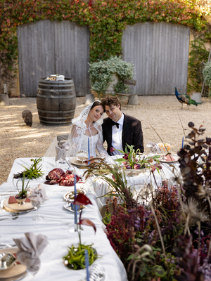
A deeply saturated, moody floral, such as burgundy blooms with dark trailing greenery, carries visual weight. It is a bold, full arrangement. If you place pale ivory candles beside it, they will look like they wandered in from a different table. They do not hold their ground. A deeply saturated arrangement needs candles with matching depth: Burgundy, Forest, Tiramisu.
The opposite applies too. Soft, muted, pastel florals like pale blush, delicate white, and soft lilac are easily overwhelmed by a heavy, saturated candle. They want something with a similar lightness alongside them.
Think of it as matching the mood as much as the colour. Bold arrangements call for confident candles. Soft arrangements call for gentle ones. When the depth agrees, the whole table settles.
.
Rule 3: Bring in a neutral to balance the palette

Here is the move that quietly holds everything together: add at least one neutral candle colour to every table, regardless of what else you are working with.
Neutral candle colours do not compete. They create breathing room between the coloured candles and the florals, and they stop a table from reading as too much. When every element is doing something bold, the eye does not know where to go. A neutral gives it somewhere to rest.
This matters most when your floral palette crosses between warm and cool tones. A blush and lilac arrangement, for example, has warm tones in the blush and cool tones in the lilac. Ivory sits quietly between the two without taking sides. It lets both colours read clearly without one overpowering the other.
Think of the neutral as the piece of the table that makes everything else look better. It is not the star. It is what makes the stars readable. It could be neutral table linens or a neutral candle. Ivory 35cm taper candles are the most versatile option across the range, as they sit beside almost any floral colour and any candle colour without conflict. If you are ever in doubt about a pairing, adding Ivory to the table is almost always the right call.
.
Rule 4: They do not need to match. They need to tone.
This one is worth sitting with, because it removes a lot of the pressure.

Toning means being within the same colour family, not being the exact same shade. A light pink candle alongside a medium-pink floral arrangement just works! Both are reading from the same pink family, just at different intensities. An Antique Pink taper beside blush roses does not clash because they are in conversation with each other, not competing.
What breaks is when two colours are technically related but sitting in different tone groups entirely. Blush is a warm, soft, desaturated pink. Flamingo is a bright, highly saturated pink. They share the word "pink" but they are pulling in completely different directions, and putting them together will read as disconnected rather than coordinated.
The practical test is a simple one: hold your candle colour up next to an image of your florals and ask whether they look like they could have come from the same world, even if they are not identical. Slightly lighter, slightly darker, slightly more muted: all of that is toning, and it works. A completely different undertone, brightness, or saturation level is when it starts to break down.
When in doubt, go one shade lighter than your dominant floral colour. Lighter almost always reads as intentional. Darker can sometimes read as a mistake.
.
Rule 5: White and ivory candles are always an option, and sometimes the best one

Coloured candles are not mandatory, and this is worth saying clearly because it is easy to feel like reaching for white or ivory is somehow settling for less. It is not.
If your florals are doing the heavy lifting, the most effective thing your candles can do is step back and provide a glow without adding noise. Tall taper candles flanking an arrangement frame it and draw the eye toward it. Pillar candles at a lower level warm the table without pulling focus.
This works particularly well when the arrangement itself is highly detailed or multi-coloured, when you are using a mix of floral types that already cover a lot of ground, or when you simply want the overall table to feel clean and uncluttered. Sometimes restraint is the strongest styling choice.
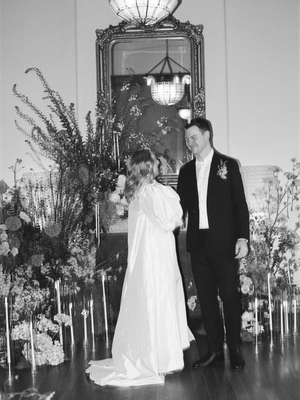
Our Rich & Dramatic floral range, for example, are statement pieces by design: they are dense, full, and made to be the focal point of the evening. Ivory candles alongside it say: Look at the flowers.
The same logic applies to fresh florals. If your florist has created something with movement, texture, and colour, white or ivory candles are the version that gets out of the way and lets the arrangement be what it is. For venues with flame restrictions, flame-free tapers are available in the same whites and ivories, so this approach works regardless of venue rules.
Colour matching is genuinely easier than it seems.
Warm with warm, cool with cool, match the depth, anchor with a neutral, and decide whether the candles are joining the palette or just adding glow. Five decisions, and the table takes care of itself.
Now that you have the rules, browse the Hueseeka candle colour range and hand-arranged florals to complete your tablescape.

Images
Bride Tribe
Storybook Co


